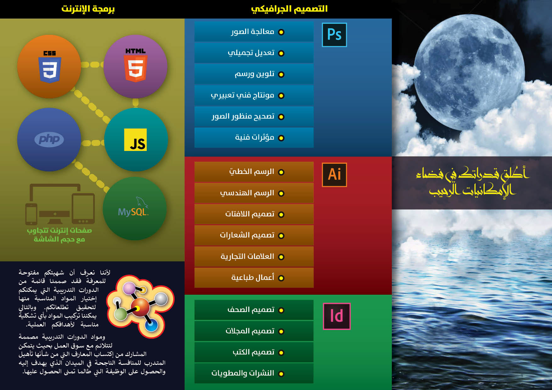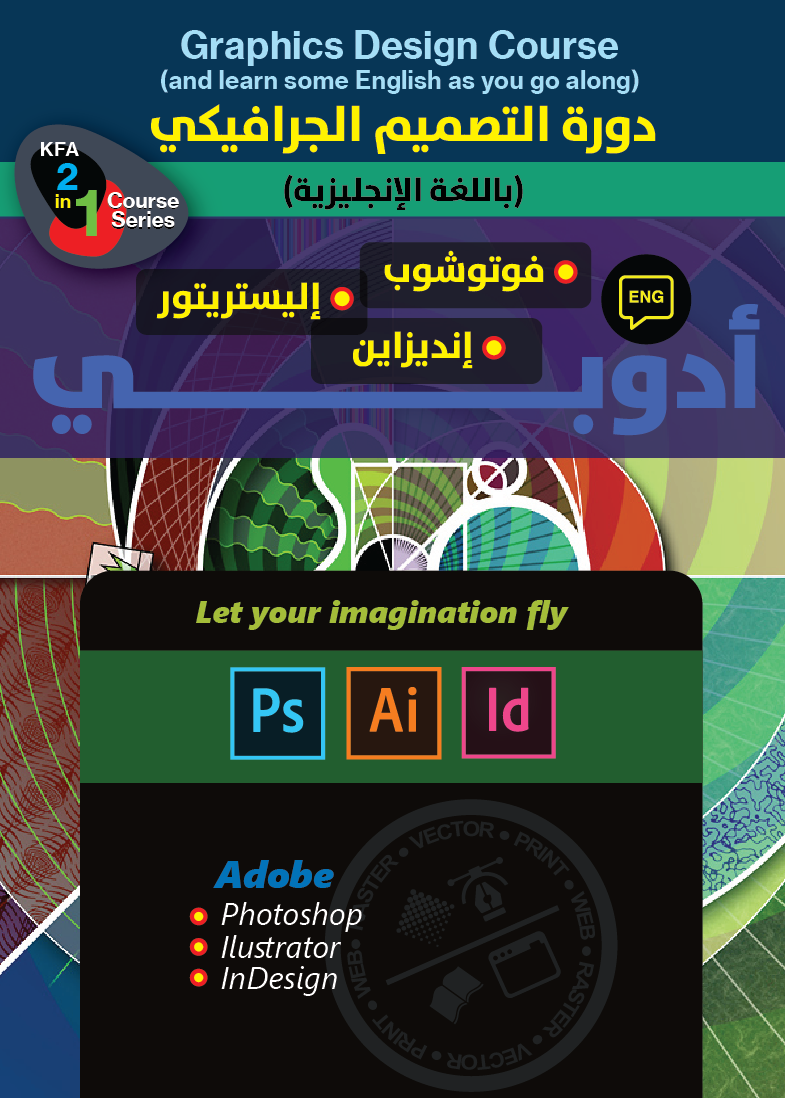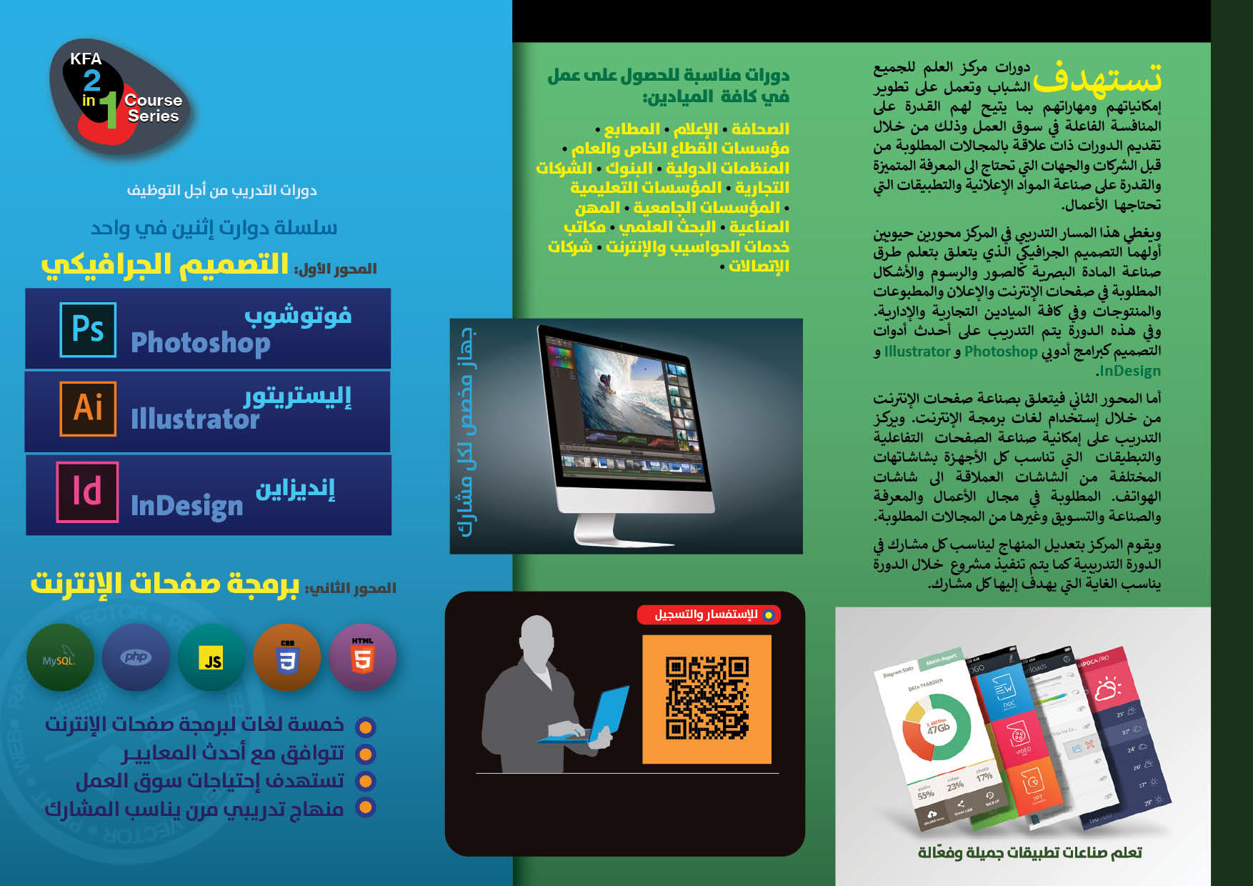
To promote the Graphics Design and Web Programming courses I was planning to deliver, I designed a set of flyers that would be suitable for both the web and for printing. The design theme is bold and made to stand out on the Facebook pages where they were meant to be published on the web. Facebook pages are very busy, and it required the bold design that would draw the attention of the visitor to the message of the promotional material.
The design exercise was an opportunity for me to test the usage of sea blues and greens. Most of my earlier designs employed a warm color theme on the red and yellow sides. In this job, I intentionally wanted to deviate and use the cool sea colors and match them with sea and water images.
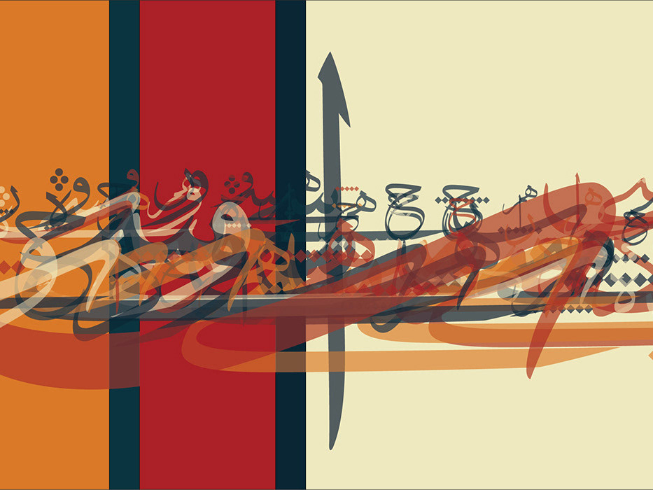
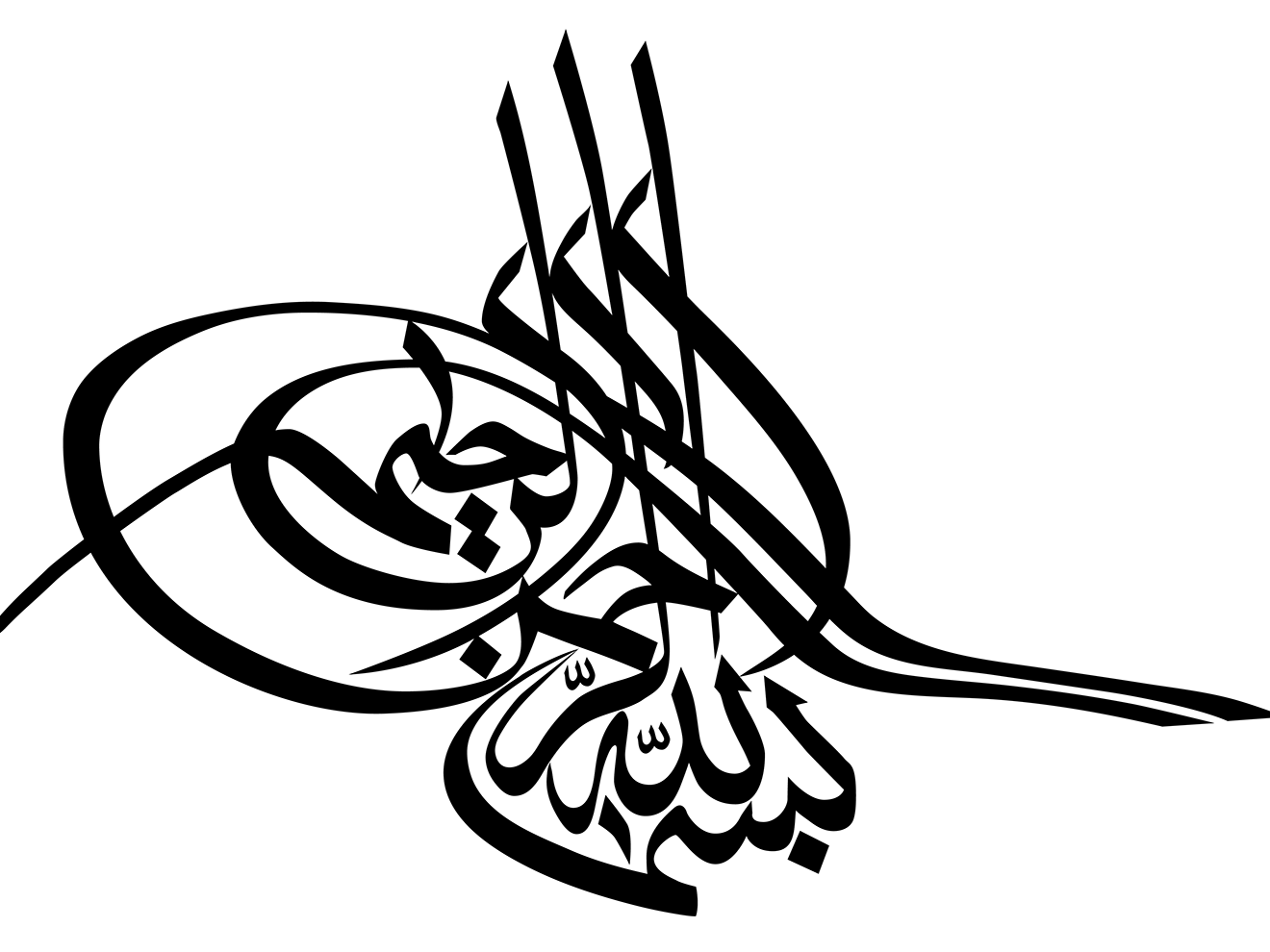
I also tried the matching of an Arabic book typeface with the bold titling I have been using in my designs for printed material and for web pages. The titling fonts and the text body font were designed by the German typographer, Lucas de Groot. The body font is the Arabic script type-style that is embedded in the Calibri font designed by Lucas. It is an interesting style that, although seems to derive and copy a lot from the Adobe Arabic type-style by Tim Holloway, includes some original features derived from traditional Arabic typography.