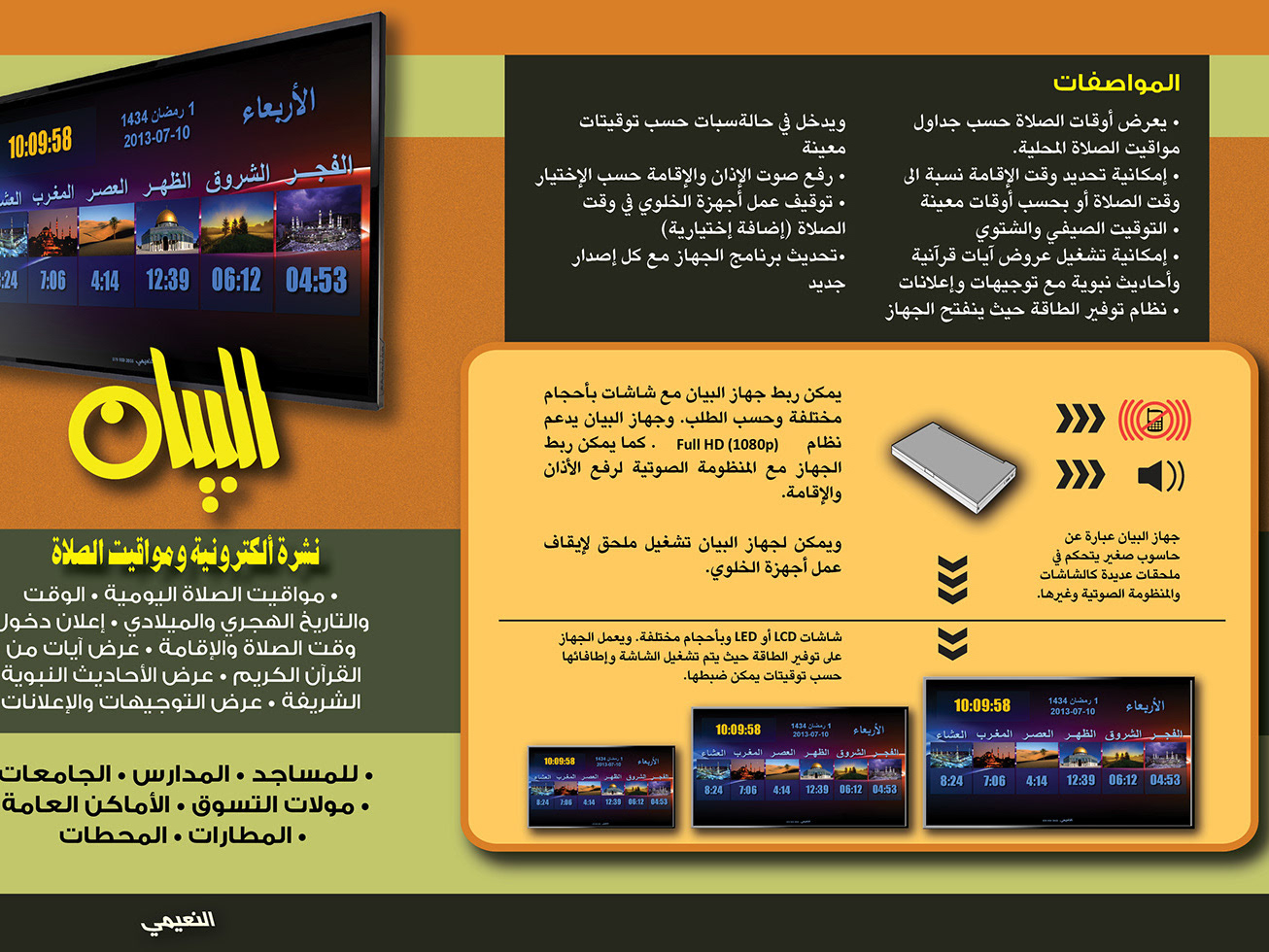
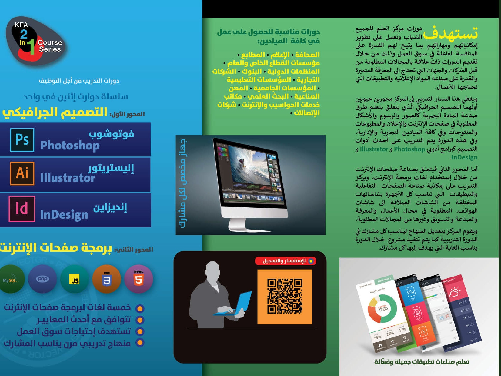
To promote my business in graphics design, I designed a trifold brochure in the landscape format. The color concept is based on warm/cool themes. The main page is simplistic, clean, and serves as a quite entry to the brochure.
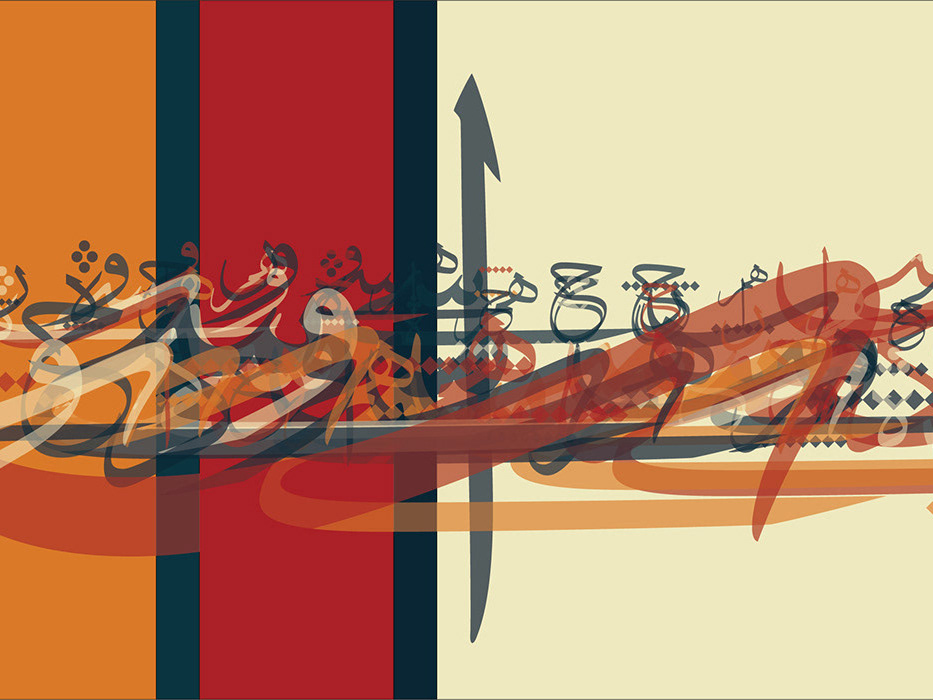
With the first unfolding of the cover flap, the user is met with an explosion of color, shapes, and text in contrast with the peaceful cover. The busy inside aims to expose the richness of the possibilities that graphic design can offer to clients. The design elements are structured around graphics and typography.
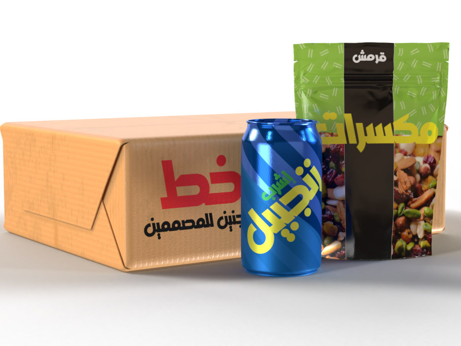
The font scheme is based on the a geometric font, Wes-FY. When used in widely spaced uppercase characters, the font implies elegance and style. This is only used on the logotype. The remaining instances using this font is set in standard inter-character width, bold.
For the body text, I used Rockwell, which combines with with the font chosen for the titles being similarly of a geometric nature. Its solid structure gives emphasis to the text and helps it stand out among the many attention grabbing graphical elements in the page.
For the typography flap, I chose the Trajan font which is expressive of typography, provided by its historical aspect. the font style integrates with the linear artwork representing typographic design.
In the end flap I switch to cool colors maintaining the typographic system that is used overall. This ties the end flap elegantly with the rest of the brochure and reflects a pleasant unity within the variations exhibited in the design.
The video below shows a UI/UX testing approach to a printed copy of the brochure. The brochure is tested with an envelope-like cover that is secured by a circular sticker with a stamp.
