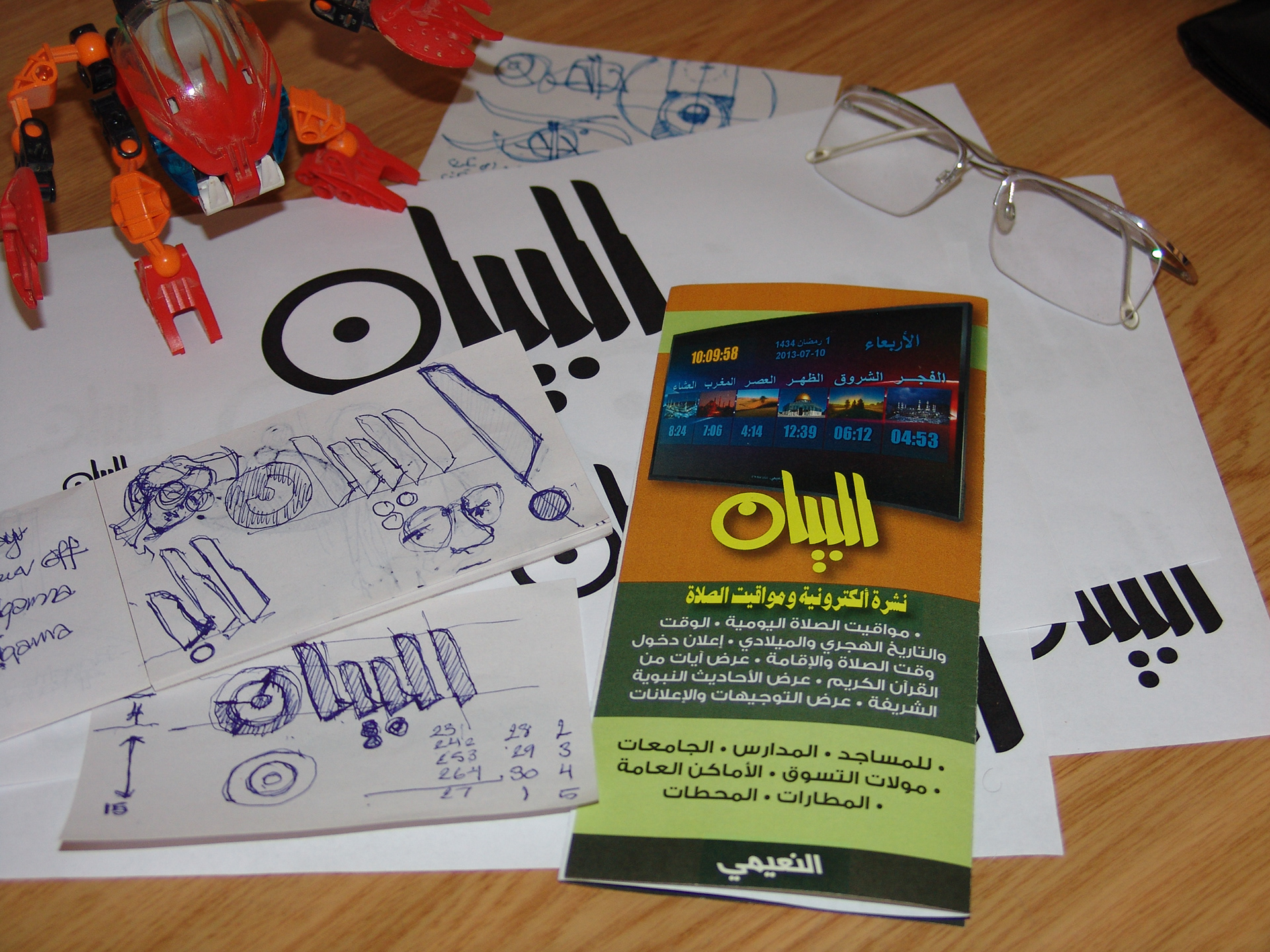
To market a digital signage program I’ve written, I designed a flyer and printed a small batch of the design for local distribution. The design was implemented mainly in Adobe Illustrator, which I find more convenient for such design tasks. Posters and single or double-page brochures are much easier to design in Illustrator which seems to be more agile than Adobe InDesign and provides better layout control. The design elements were then assembled in Adobe InDesign.
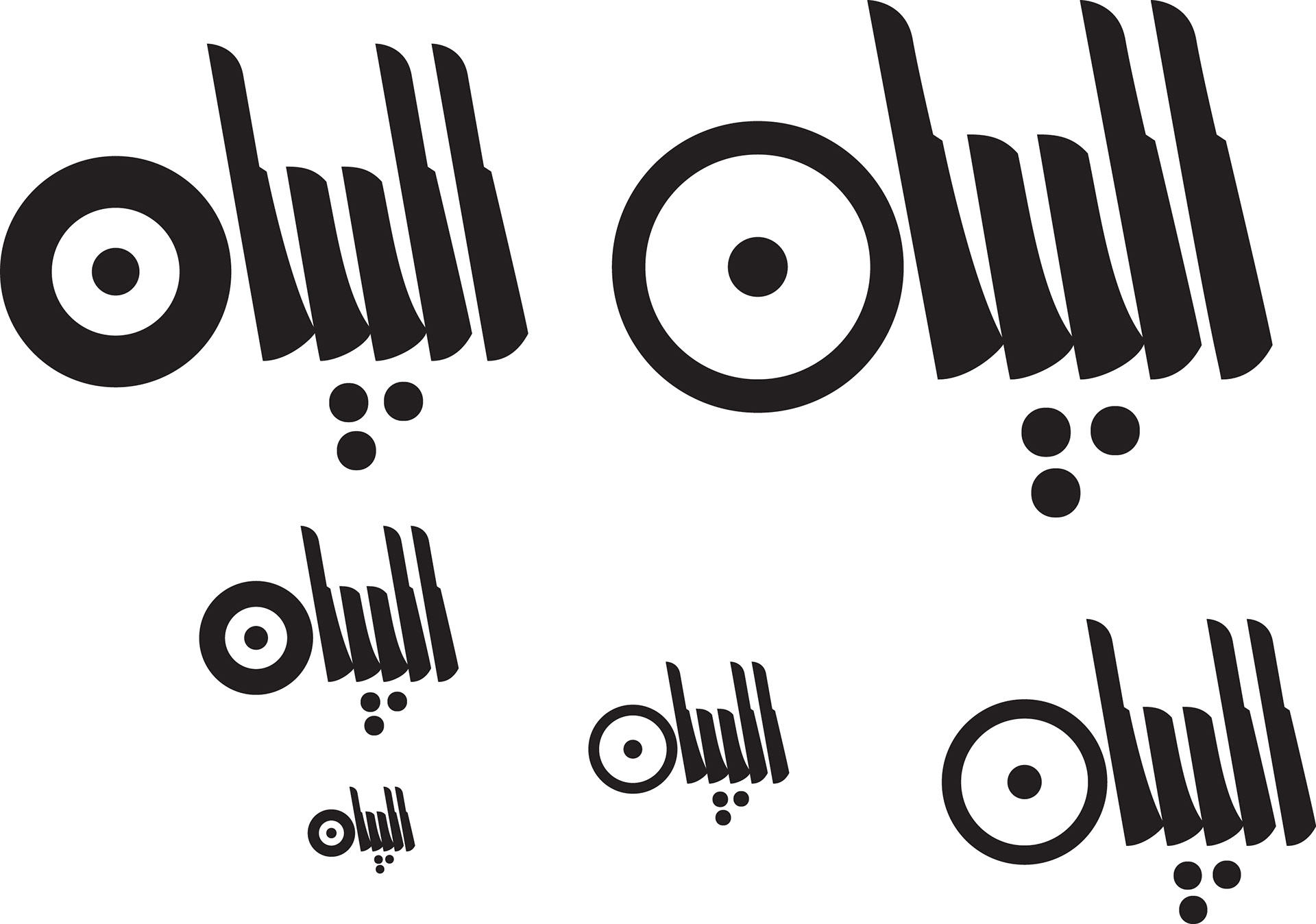
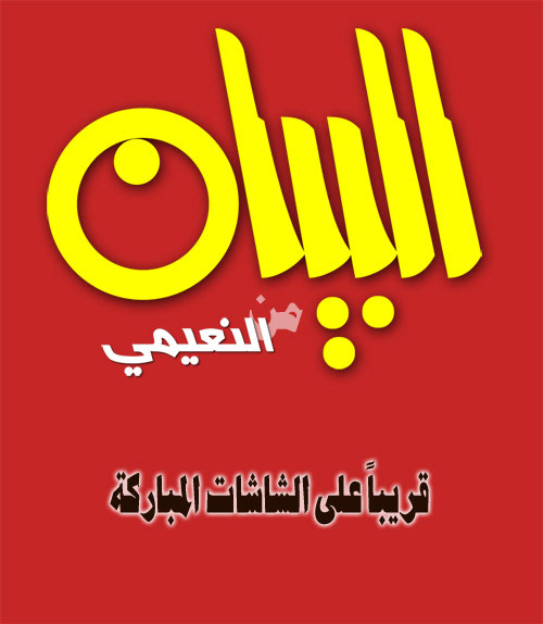
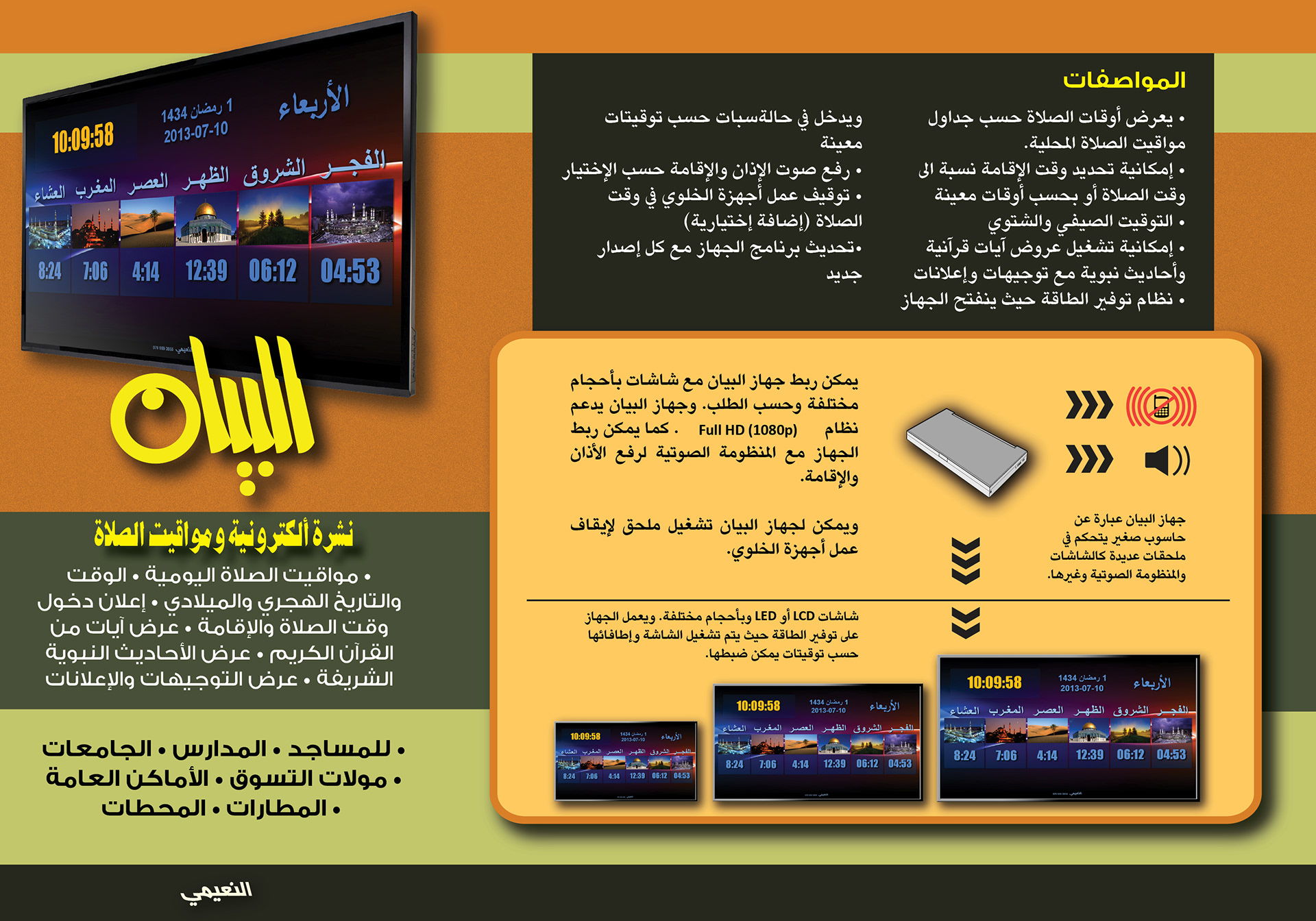
The logo I designed for the signage program branded the cover of the brochure. The typographic logo representing the name of the product in Arabic, Bayan, has the potential to be the root for a full-fledged Arabic display font. The logo is also used in the program’s interface, which is basically a dialog box with multiple tabs.
Almost 30 years after the design of my first printed project, the flyer borrows several design features. The black and yellow theme is imminently observed, and the fascination with the Yakout font is another repeated design feature. The main title of the brochure, represented by the logo, is as much geometric as the kufi titles used in the 1980’s project.
The replication of the former design was not deliberately intended. In fact, I consistently strive to vary my design style based on the requirements of each project. Nevertheless, persistent style identity is nothing that I am reluctant to admit, and additionally since the functional requirements of the two projects had similarities, the style of the two publications seem to be close in result. I noticed the style similarity in retrospect, and it is a matter that I reflect upon to better understand my design responses and to improve my design skills.
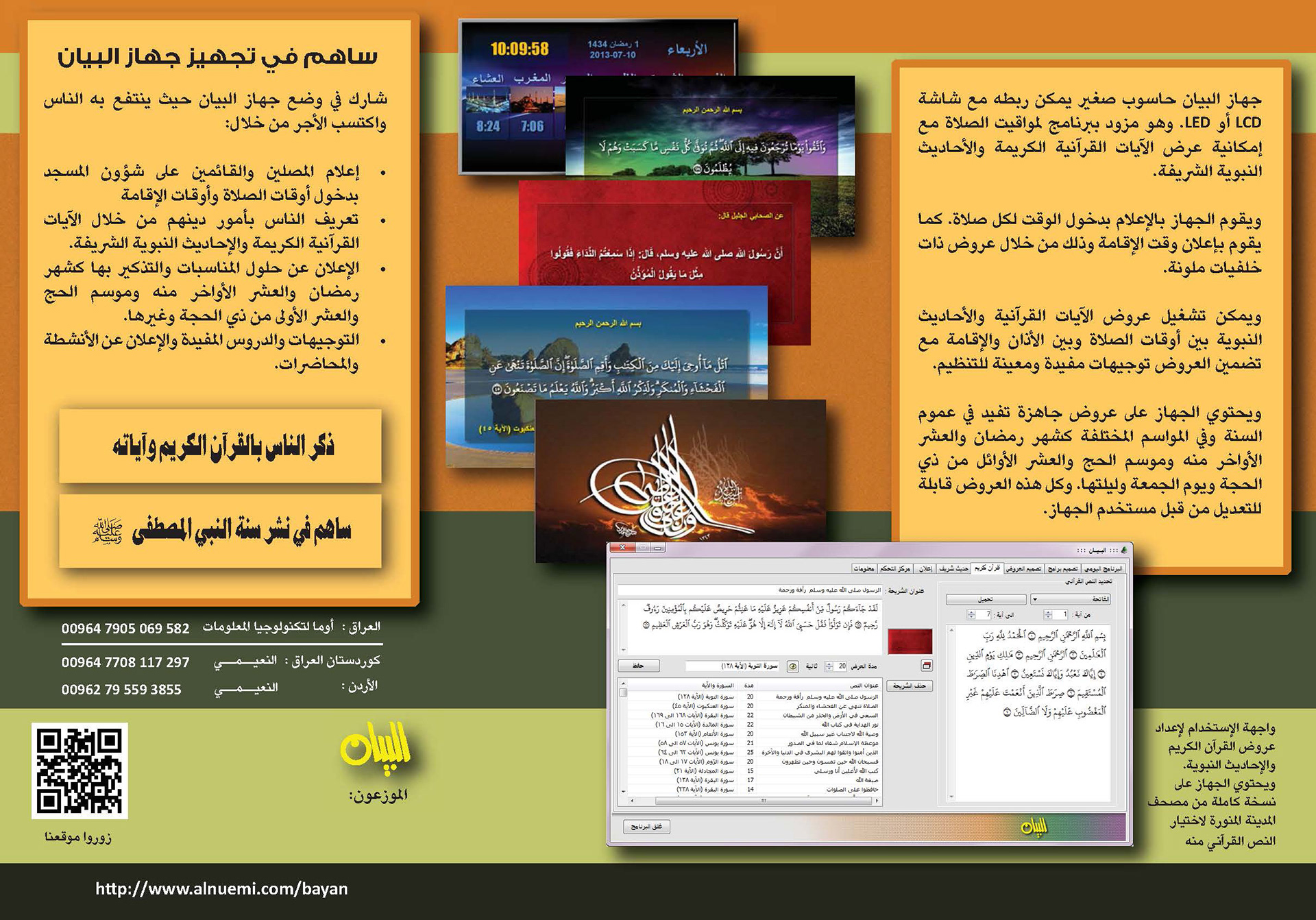
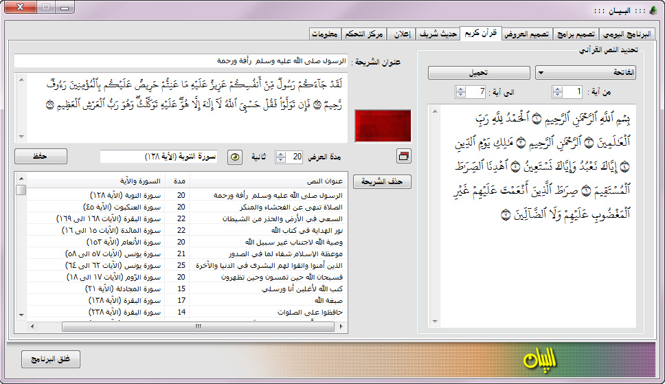
The digital signage project required the design of a user-interface with the challenge of using the systems Arabic fonts. Available Arabic fonts did not render well in small sizes on the screen, which is an inherent problem with the traditional Arabic font styles. However, this project revealed the potential of the Arabic portion of the Tahoma font, which had a nice character in small sizes.